We have released a new version of SurveyTown and in this release we improved the look of our charts. Here’s a quick guide the changes.
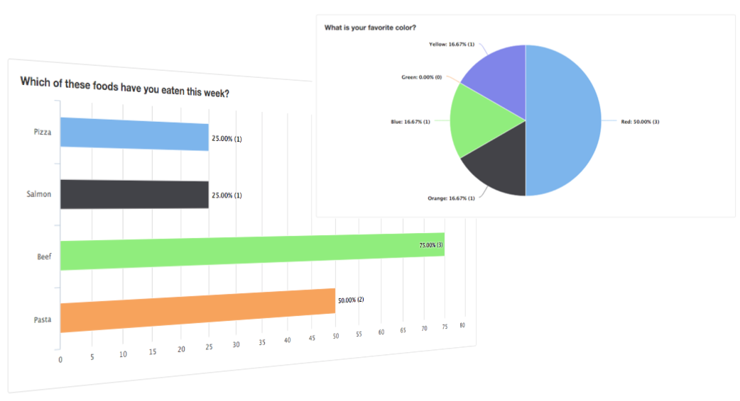
Multiple Choice Choose Multiple
New Look
Original Look
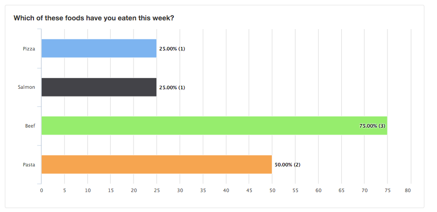
The new look takes shows results in a graphical format so as to quickly understand how many times an option was chosen in relation to other options. There is also a structural change in that the percentage of responses. In the new look the percentages a particular options are chosen are calculated against the number of people who answered the question as opposed to the number of people who took the survey itself. This keeps people who did not respond to the questions from skewing any results.
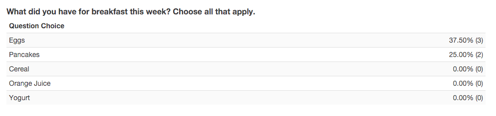
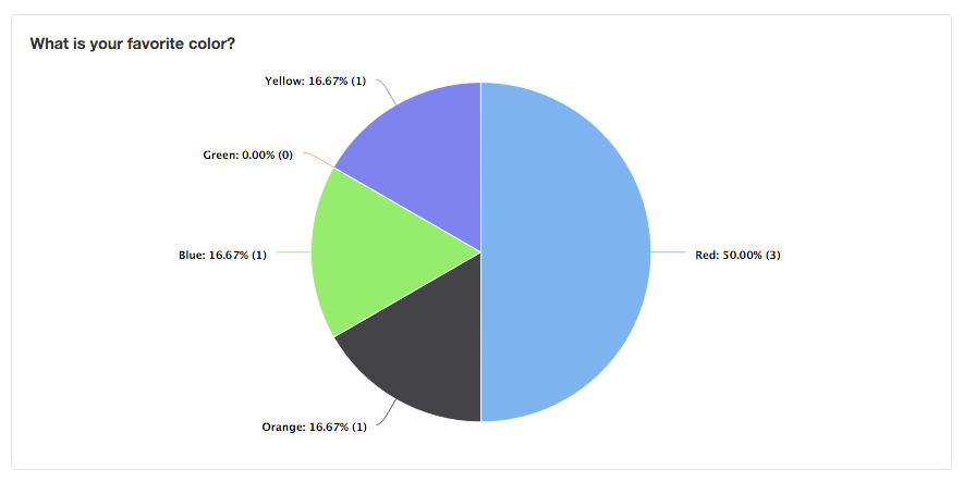
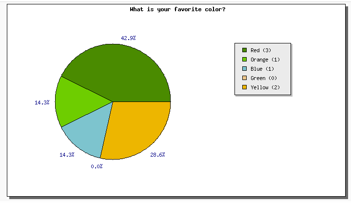
Multiple Choice
New Look
Original Look
Multiple choice choose one as the more modern new look and feel and the number of times an option what chosen is now represented next to the percentage itself.
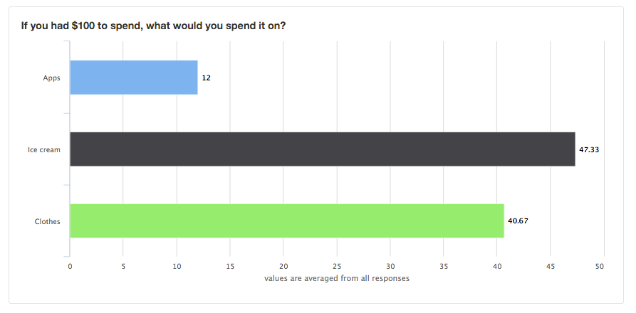
Add To Sum
New Look
Original Look
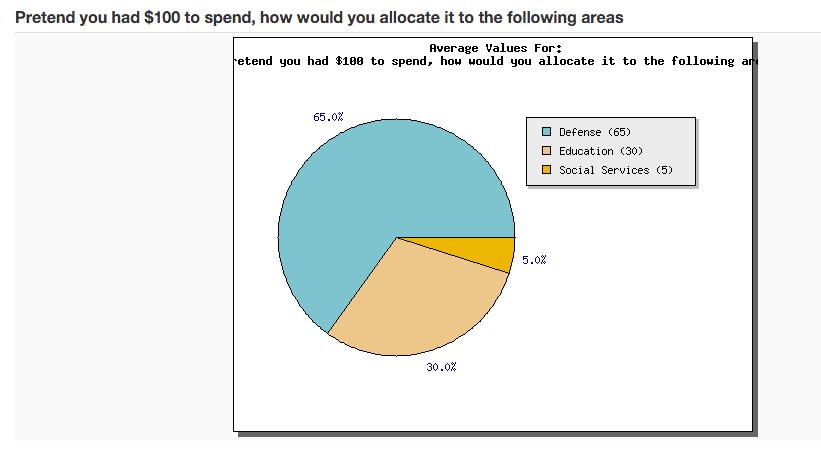
We represented the average values in the Add To Sum reports in bar charts instead of a pie charts because the bar chart does a slightly better job of serving the essential function of Add To Sum which is to compare the choices against one another. Also in Add To Sum, we felt it was less effective think to see the results as a percentage, which is how the pie chart treats it, as opposed to values, which is how a bar chart treats it.
We hope you enjoy the changes. Please feel free to let us know your comments at support at surveytown.com.