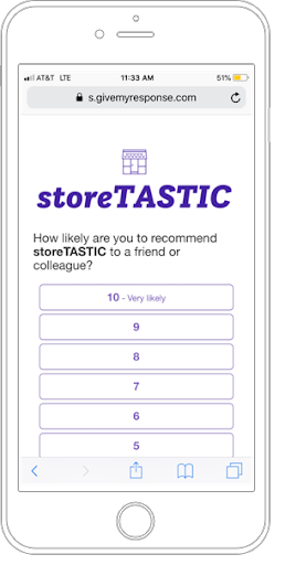
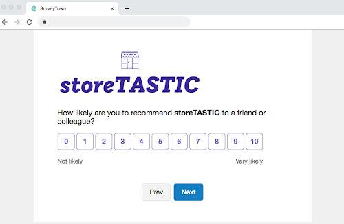
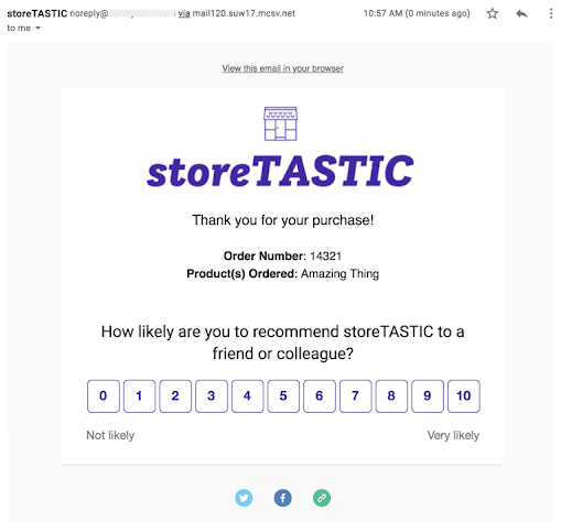
We made a bunch of updates to the look and feel of NPS (Net Promoter Score), CES (Customer Effort Score), CSAT (Customer Satisfaction Score), and Ratings questions and have given you more control to help them match your brand. Our updates have been made to make your customer experience surveys more visually pleasing and customizable. No worries if you haven’t had time to check out all the new features—we’ve pulled them together to show you what we’ve been working on.
A new and improved look of surveys for mobile, desktop, and email experiences
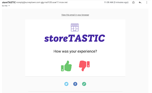
We’ve switched to a more modern look for our survey experiences. This new look is used for mobile, desktop, and email experiences and is a little more pleasing to the eye (or at least we think so). No matter where you’re sending your survey, you can be sure that it will look good and represent your brand well.
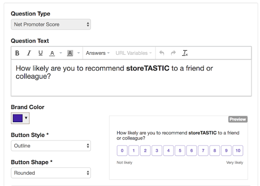
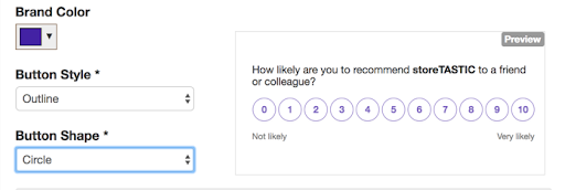
New question preview during build mode
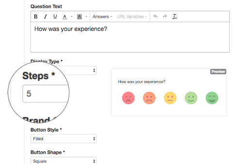
Now you can see exactly how your question and style options will look during build mode so you don’t need to switch back and forth between build and preview modes.
Customize colors, shapes, and styles used in NPS, CES, and CSAT surveys
Branding is important. That’s why on top of making some changes to make our surveys look better, we’ve also added a number of options for you to customize your surveys. When building your survey, you have the option to change colors, shapes, styles, and more.
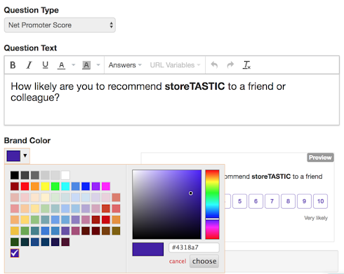
Choose your brand color
You can select a specific hex code, which makes it easy to keep your surveys on-brand. This also makes it easier for consultants and agencies to white label the platform and provide better branding options to clients.
Change the button shape and style
You have more options for adjusting the look of the buttons. Select rounded buttons, circle buttons, or square buttons, then choose whether you want your brand color to just be the outline or to be the fill. All of these style options allow you to not only do something that you think looks better but also to create a survey that better matches your brand’s visual aesthetic.
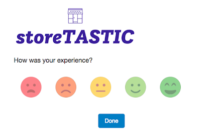
Rating questions can have thumbs, faces, or stars
Who said surveys and customer experience questions can’t be fun? Add the finishing touches to your questions with up and down thumbs, emojis, or stars. To make this feature a little easier to use, we’ve also added the ability to change the number of icons that appear. For the thumbs, you’ll want to choose two under the Steps dropdown. You can also choose to use four stars, three faces, or five boxes—whatever works best for you.
CES and CSAT answers can now be shown as text
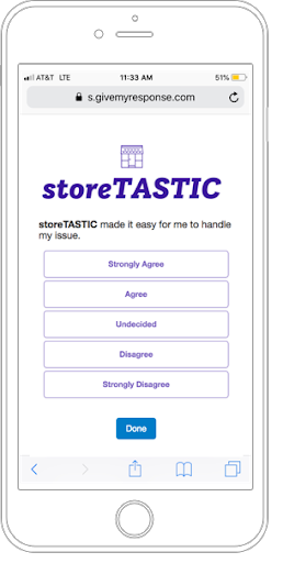
In case you have something against numbers, we’ve made it so that you can use text on your CES and CSAT questions. Now you don’t have to worry about whether or not your customers are confused about whether or not 1 or 5 means strongly agree.
As a company that lives and breathes customer feedback, we’re always listening. We’ve been hard at work making changes that will help you build better questions faster so that you can focus more on analyzing the results. We hope you enjoy these new features!


