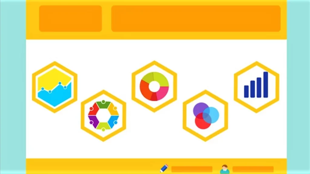
The best way to understand survey data is to visualize it. So, after collecting and analyzing results, it’s crucial to present them in a clear, concise, and visually appealing way. In this article, we’ll discuss the best practices for creating a successful visualization of research data.
Keep reading to discover the top ways to present survey results, helpful tips on doing it right, and the best online tool that can present all the data for you.
Presenting Survey Results
The best way to present survey results to help explain your data is to use visuals (graphs, charts, etc.) You should organize the presentation in a way that’s easy to follow and understand, with unbiased and objective results. Find your options below.

1. Graphs and Charts
If you’re looking for the most visually appealing ways to present survey results, graphs and charts are good options. These make a quick and easy-to-understand graphic.
Here are some of the commonly used types of graphs and charts:
- Pie chart: A popular chart type, it shows the breakup into sections, with the sum of all slices being 100%.
- Venn diagram: Uses overlapping shapes (often circles) to illustrate the logical relationships between different sets.
- Line graph: Displays how one or more variables or results change over time by tracking the ups and downs of the data.
- Bar graph: Simple to create and easy to interpret, it’s the most commonly used type to track changes over time or compare things between different groups.
2. Infographics
Using infographics alongside graphs and charts adds a creative twist and enhances the message instead of distracting from the data.
The eye-catching graphic visual representations will make survey results more impactful and visually pleasing, which will leave an unforgettable impression on the audience.
3. Data Table
Tables are an efficient way to display numerical data easily. Software like Excel or SPSS helps create tables, and you can even remove unnecessary information to focus on the data intended to be shared with a specific audience.
Similarly, spreadsheets like Excel might not be visually appealing, but they are an excellent option for organizing large amounts of data for a survey results report.
4. Video Infographics
Using animation for an informational video, like in videos or animated infographics, is an excellent strategy for presenting survey results.
With sound, animation, and colorfully displayed statistics, you’re bound to keep your audience engaged. It’s an effective communication tool to convey complex and concrete information effortlessly.
5. Presentations
Combining visuals with the text through a presentation is a practical way to present survey results in an understandable way.
Not only does a presentation allow you to present the early stages of your survey, but it’s also good for showing your questions, hypotheses, and analysis methods.

What To Keep in Mind When Presenting Results
When presenting survey results, be sure to do the following.
- Explain technical terms your audience might not be familiar with.
- Put the results in context, comparing them to other surveys or data sets.
- Highlight the most critical findings from the survey.
- Be clear about the meaning of the results and the way you obtained them.
The most important thing to remember when presenting survey results is that correlation doesn’t equal causation. It implies that just because two things are related doesn’t mean that one caused the other.
You must also be aware of potential biases in your sample when presenting survey results. For example, self-selection bias occurs when people who feel strongly about a topic are more likely to respond to a survey related to it.
Visualize Your Data With SurveyTown
SurveyTown is your one-stop solution for surveys. Not only does it help create any survey (even completely custom ones), but it also creates real-time survey reports to help see your ratings.
The software will collect all the responses to your survey and present the results in beautiful charts and graphs. From seeing the number of responses to viewing your aggregated statistics on responses in charts, SurveyTown simplifies the process of analyzing and presenting the survey results.
You can also use the APIs to export data, retrieve response data, or integrate your survey data into other applications.
Final Thoughts
As is evident, your work doesn’t stop at merely collecting and analyzing survey data. It’s equally important to present it the right way so that your audience understands the outcome of your survey clearly.
While you can try to create graphs, charts, infographics, tables, or presentations, SurveyTown can help simplify your work by doing all the visualization for you. Check out our pricing plans here!

