We are pleased to announce a SurveyTown upgrade. In this release we upgraded the application interface as well as how your surveys look to respondents especially when viewed on a mobile device. Internally, we called this release “BROOM” because we are cleaning up and unifying the entire experience of the application. Here are the highlights :
Responsively Designed Surveys
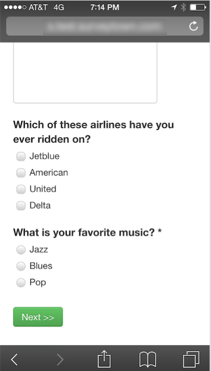
Our new styles offer a much improved experience for respondent who are taking your survey on a mobile device. Responsively designed means your surveys will look great on both a mobile device and a desktop and survey respondents will no longer have to “pitch and expand” to fill in answers on their phone. Here’s a look at the new styles on an iPhone.

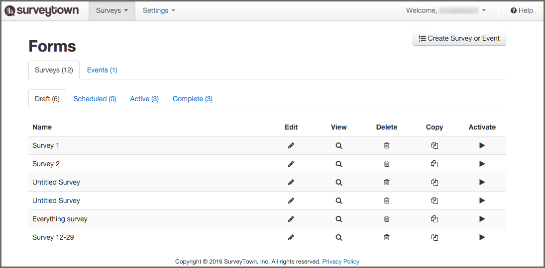
New Look-and-Feel for the Interface

We cleaned up and unified the user experience of SurveyTown. The changes include
- New-Look Tabs
- More Whitespace
- Style Unifications
- Upgraded Icons
- Improved Notifications and Error display
Survey Default Style Changes
Our default styles for surveys changed. We have bolded the question labels, increased font sizes and made more intelligent spacing between questions.
We hope you enjoy the release and if you have any feedback, please feel free to reach out to support@surveytown.com. And happy surveying!
Drew


